Go Back
Career website
VideoCV
VideoCV
VideoCV
My ROLE
UX/UI Designer
UX/UI Designer
Team
Stakeholder
Stakeholder
YEAR
2025
2025
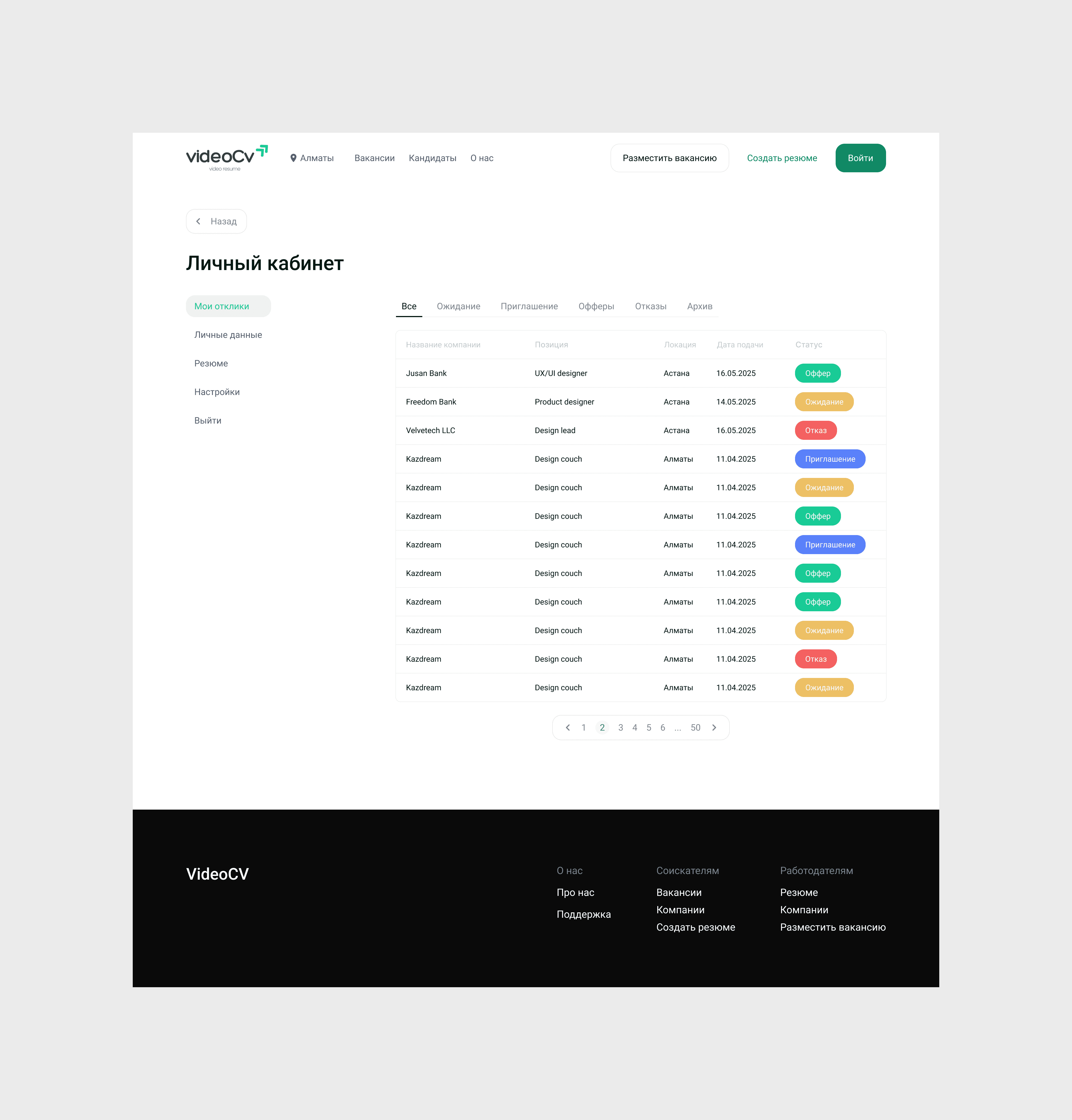
Overview
VideoCV is a platform for finding candidates, job openings, and project orders.
My task was to redesign the website to elevate the overall user experience, making it more intuitive, visually appealing, and aligned with modern design standards. The updated design aimed to simplify navigation, improve usability, and present content
in a clear and engaging way.
VideoCV is a platform for finding candidates, job openings, and project orders.
My task was to redesign the website
to elevate the overall user experience, making it more intuitive, visually appealing, and aligned with modern design standards. The updated design aimed to simplify navigation, improve usability, and present content in a clear and engaging way.
Goal:
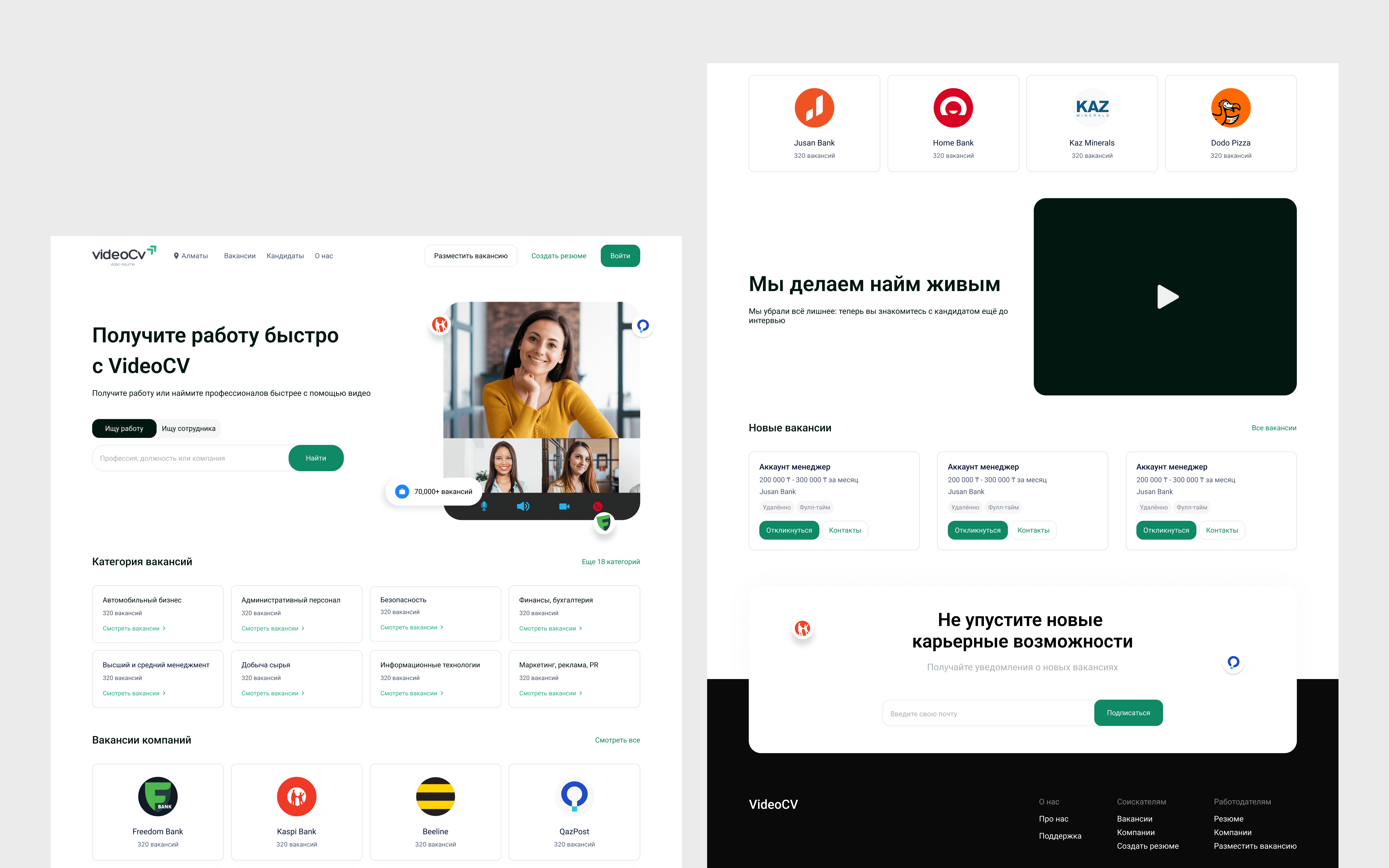
Create an intuitive website by designing a seamless user flow, removing unnecessary elements, and arranging components in a logical and user-friendly way.
Add new essential pages to enhance the site’s functionality and content structure.
Enhance visual appeal by refining the color palette and overall styling.
Target audience:
Target audience:
People who are looking for candidates or job opportunities.
People who are looking for candidates or job opportunities.
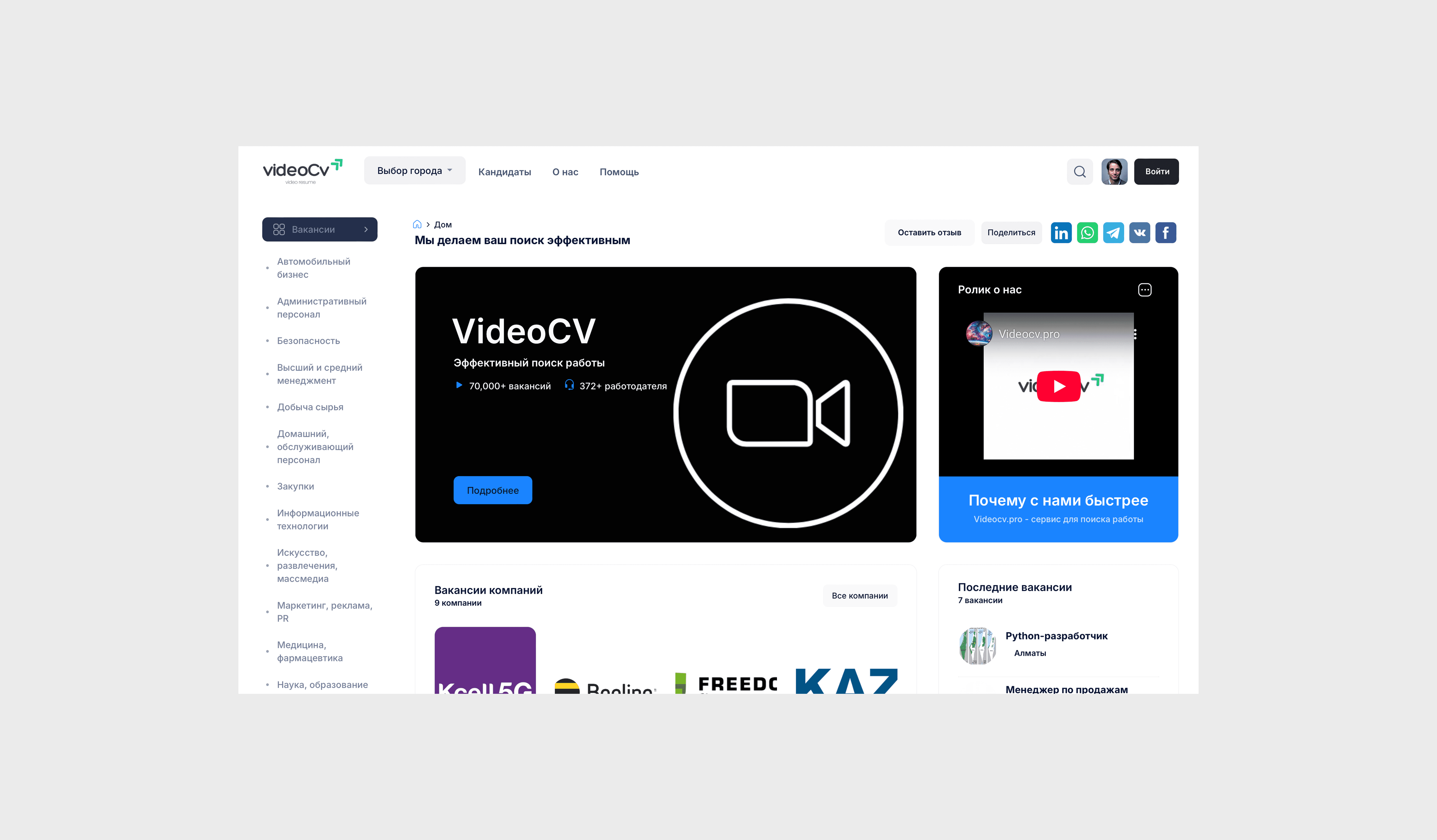
Old design:
User problem:
User problem:
Categories and sections are disorganized, making it hard to find information.
The homepage is cluttered and lacks clear structure.
Key actions like job search and resume posting are not visually emphasized.
Categories and sections are disorganized, making it hard to find information.
The homepage is cluttered and lacks clear structure.
Key actions like job search and resume posting are not visually emphasized.
New design:
Work on the task:
Identified key usage scenarios through analysis of the current platform and stakeholder interviews.
Defined the main user tasks and challenges when using the site.
Conducted research on best solutions and competitor analysis.
Redesigned the interface based on the gathered data and the new UI Kit.
Identified key usage scenarios through analysis of the current platform and stakeholder interviews.
Defined the main user tasks and challenges when using the site.
Conducted research on best solutions and competitor analysis.
Redesigned the interface based on the gathered data and the new UI Kit.
Research:
The following types of research were used during the task:
The following types of research were used during the task:
User Interviews
Interviewed platform users to identify their needs, goals, and pain points. Gathered qualitative insights to guide UX improvements.Stakeholder Interviews
Discussed business objectives, priorities, and expectations with stakeholders to align the redesign with company goals.Contextual Observation
I observed users “in the field” to understand how they use the platform, how they prefer to search for jobs or candidates, and how they interact with the interface within specific featuresBenchmarking
Compared the platform against industry leaders to measure performance, design quality, and usability standards.
Vacancies page:
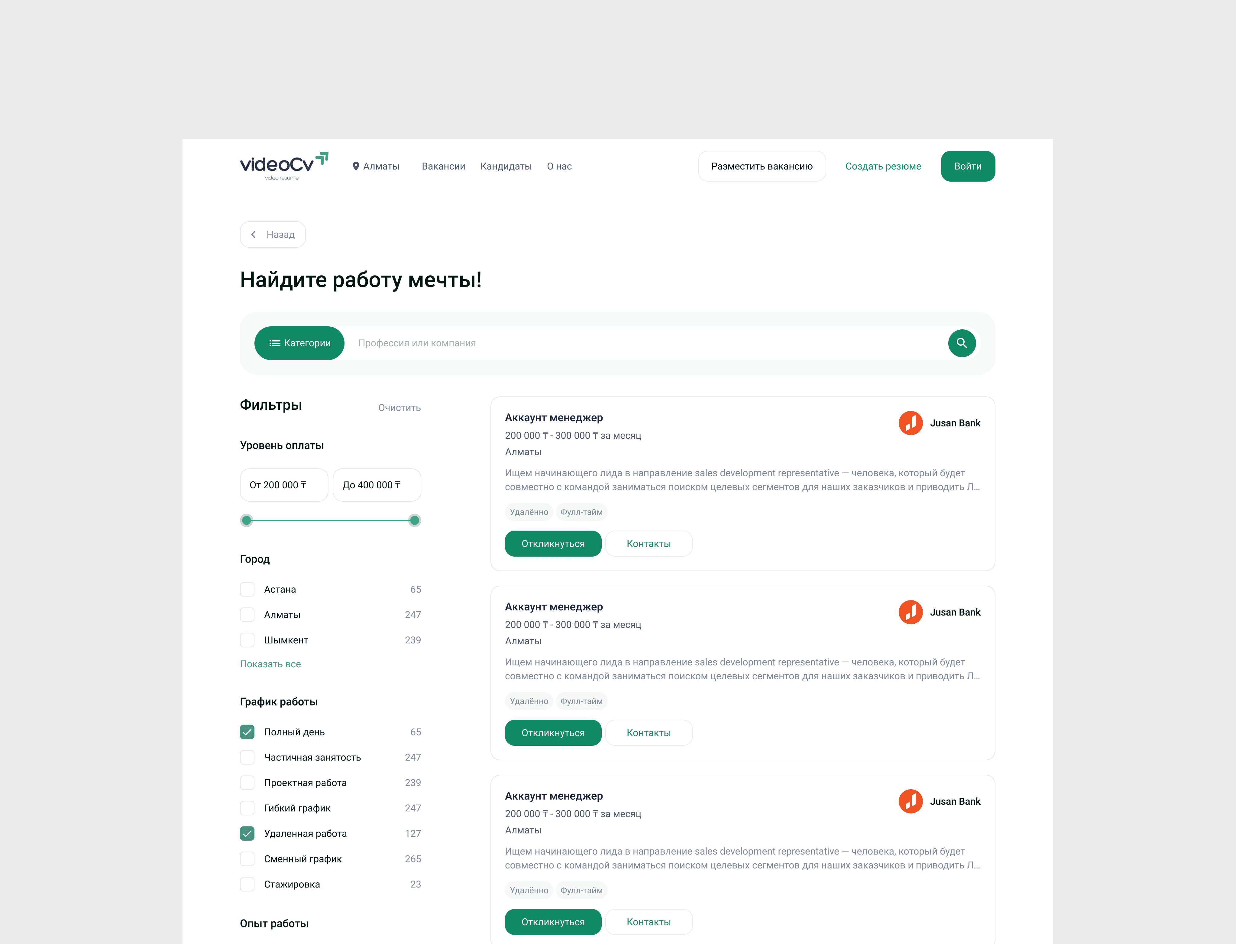
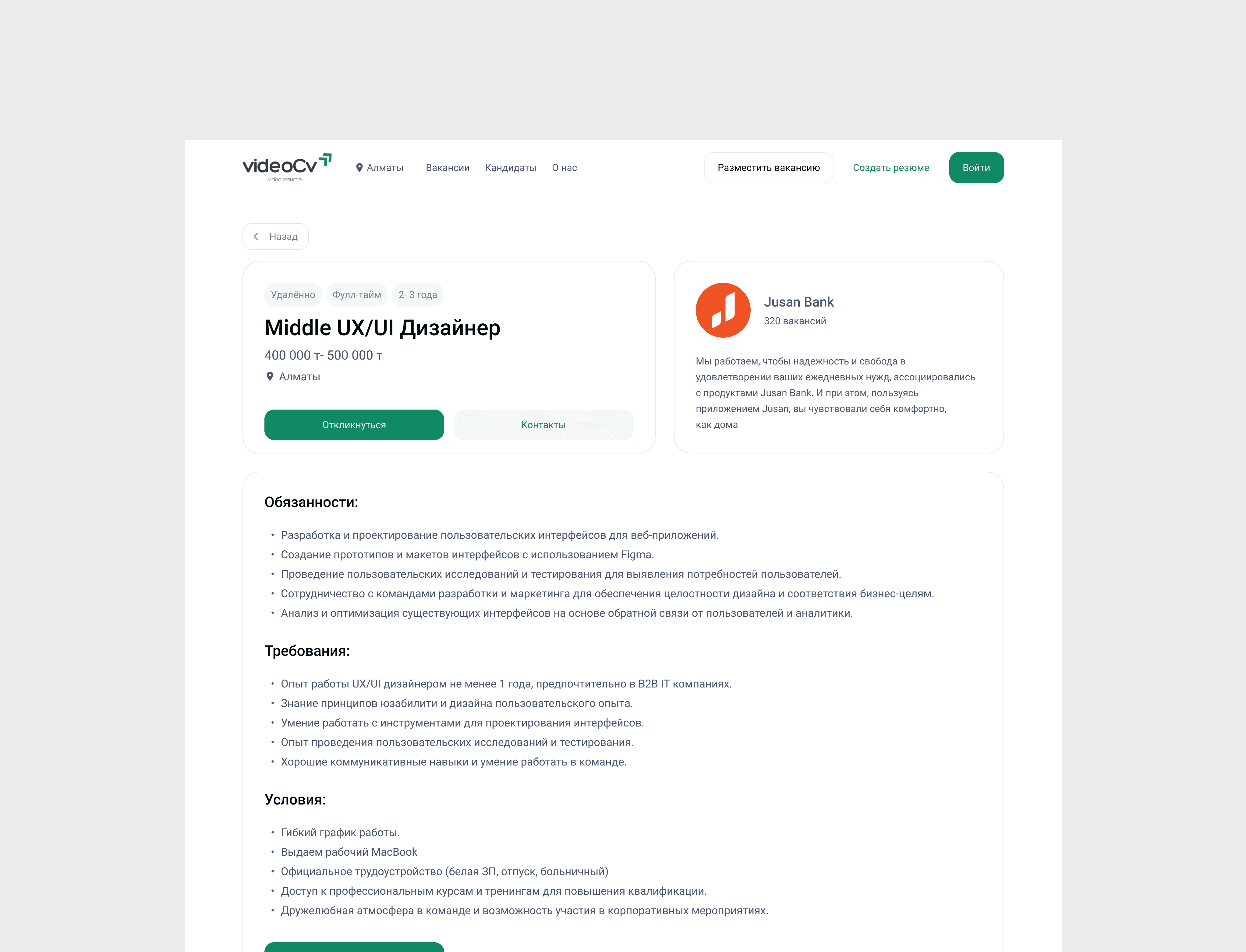
Placed the search bar at the top of the page, as most users prefer finding jobs this way.
Added filters on the left to help users quickly narrow down results.
Updated job cards to display only the most important details and include a clear “Apply” button for instant applications.
Added category selection to the search, allowing users to browse jobs by industry or field.
Resumes page:
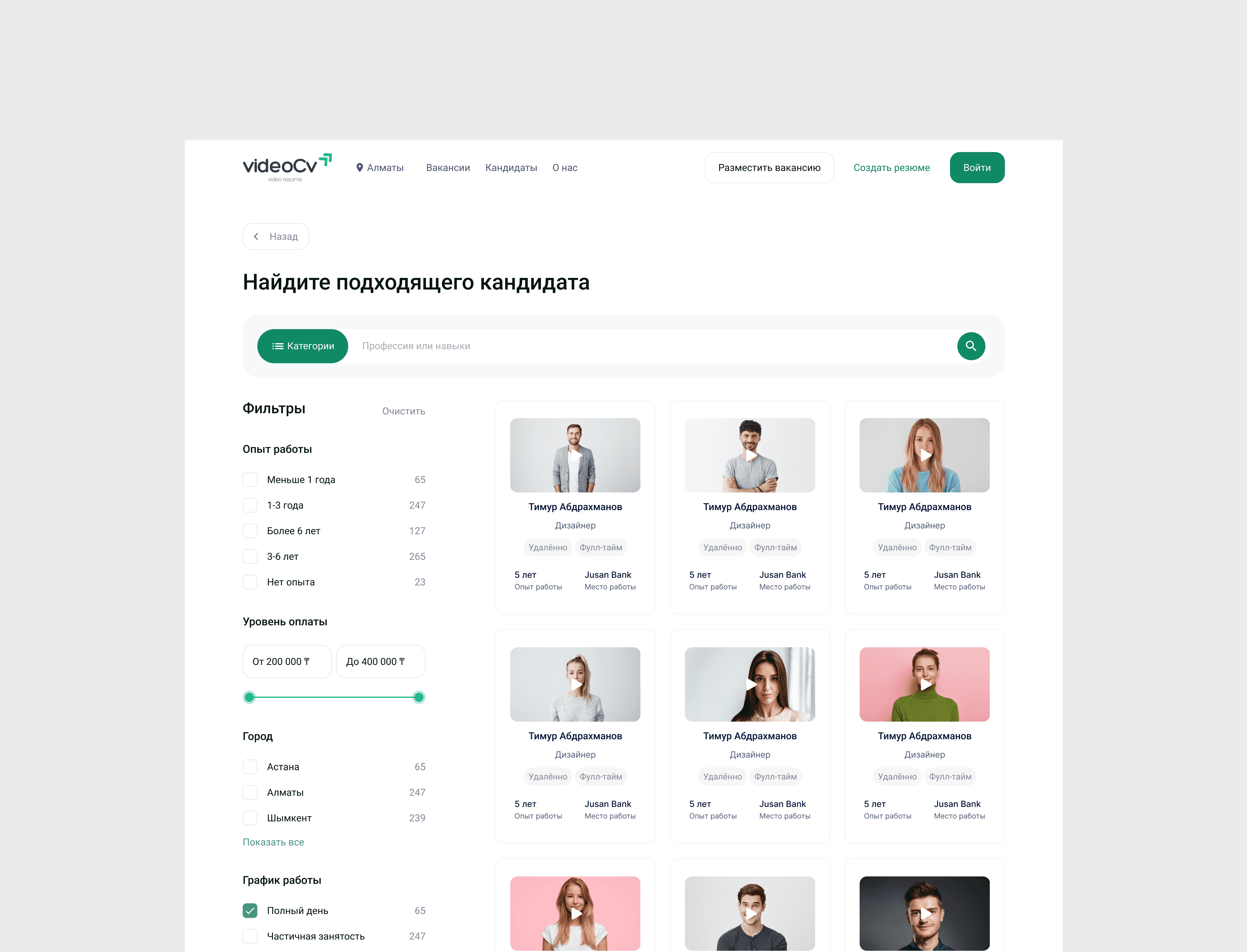
Resume page:
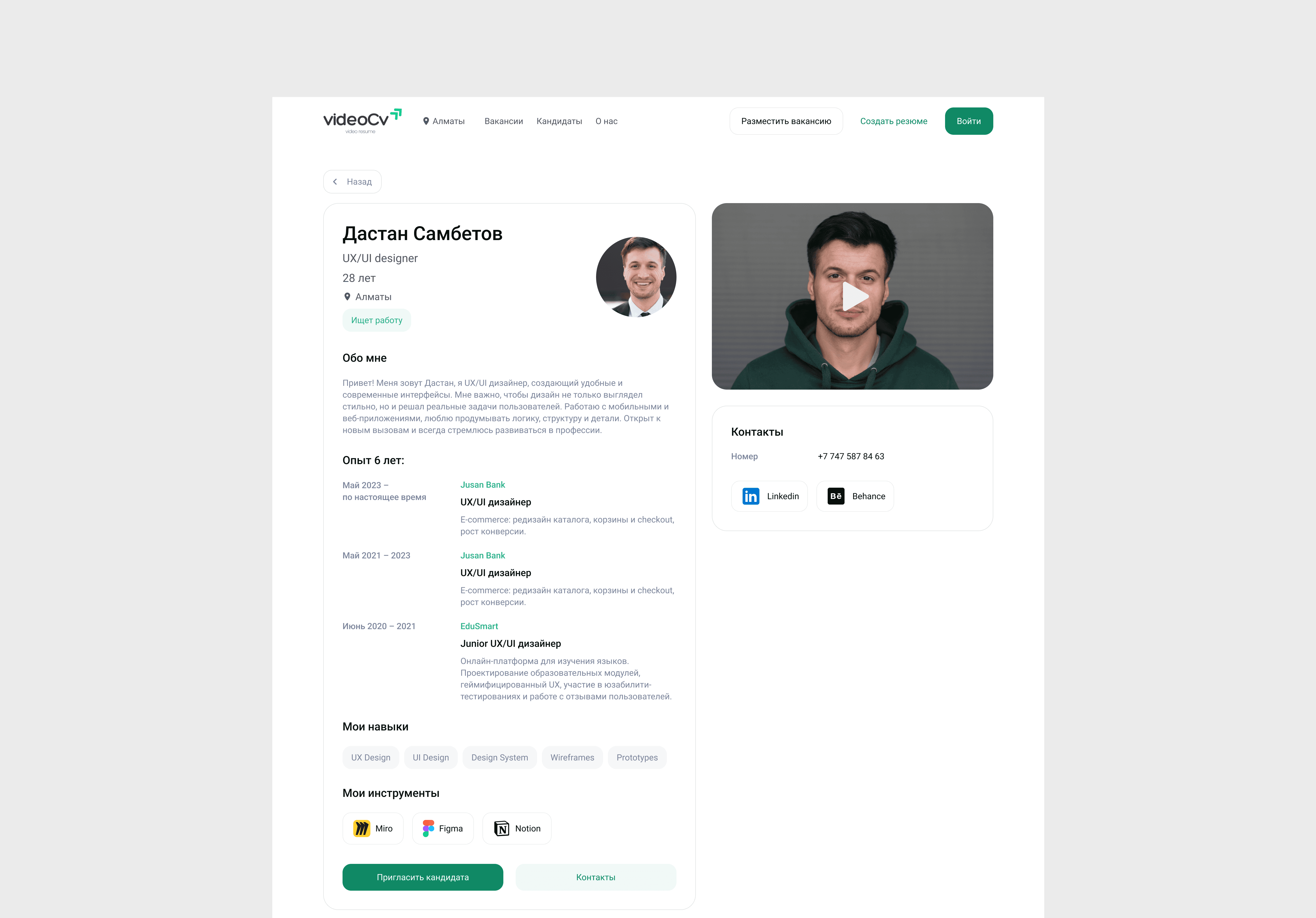
Structured the candidate’s resume page into clear sections: About the Candidate, Work Experience, Skills, and Tools to make the information easier to read.
Placed the candidate’s video at the top right for quick access.
Added a separate block with contact details and social media links.
Included a clear “Invite” button at the bottom to quickly reach out or send an offer.
Other pages: